|
|
Post by Tull50 on Dec 5, 2012 16:52:57 GMT -5
Post here your favorite cover  I have many in my head but I'll start with this: Minstrel In The Gallery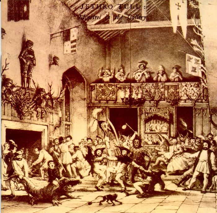 |
|
|
|
Post by jtul07 on Dec 5, 2012 17:31:27 GMT -5
Ahoy matey. ;D Give me a 'Broadsword' cover and clear understanding.  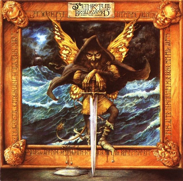 |
|
|
|
Post by janu on Dec 5, 2012 18:50:17 GMT -5
|
|
|
|
Post by TM on Dec 5, 2012 19:43:01 GMT -5
Ahoy matey. ;D Give me a 'Broadsword' cover and clear understanding.   Hard to beat this one. |
|
|
|
Post by Mothfairy on Dec 5, 2012 22:50:55 GMT -5
|
|
|
|
Post by Mothfairy on Dec 5, 2012 23:03:02 GMT -5
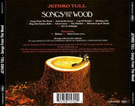 But this is the best back cover. I mean, a tree stump record player, how cool is that. You can see Mothfairy is a treehugger and butterfly kisser. ;D |
|
Deleted
Deleted Member
Posts: 0
|
Post by Deleted on Dec 6, 2012 21:33:16 GMT -5
Good topic for a thread. Tull has a huge repertoire of good album covers. Catfish Rising, Crest of a Knave, Roots to Branches, to name a few. I will participate in the debates to come  |
|
|
|
Post by TM on Dec 6, 2012 22:05:55 GMT -5
 But this is the best back cover. I mean, a tree stump record player, how cool is that. You can see Mothfairy is a treehugger and butterfly kisser. ;D I always loved the tree stump record player. Classic. And great idea for another thread - back covers. |
|
|
|
Post by flutestobranches on Dec 7, 2012 13:19:54 GMT -5
The back cover of "Stormwatch" has always been a favorite of mine. One of the cool things about Tull has been the unique artwork the music comes wrapped in. Soooo many good album covers - it's hard to choose, really!  |
|
|
|
Post by Mothfairy on Dec 8, 2012 1:50:38 GMT -5
Hmm, I wonder if that says something... I've always preferred really great photography as artwork, particularly animals, sceneries, etc. The two I've posted obviously being photography similar to what I mentioned.
TM great idea, well now I've already said mine. Haha. I've also always liked the front, because it took me so long to see the black dog, I am not sure why...
|
|
|
|
Post by LJG on Dec 8, 2012 10:58:06 GMT -5
On a different note... this has always been my least favourite. Too digital ..... and palm trees? Does not make me think of Tull.  |
|
|
|
Post by Mothfairy on Dec 8, 2012 11:09:03 GMT -5
Yeah that's not so good...
|
|
|
|
Post by LJG on Dec 8, 2012 11:12:51 GMT -5
Yeah that's not so good... It made no sense. The most stripped down, organic sounding, acoustic based album in years.... and they go with a cold, clinical, digital cover. LOL At least the music was recorded wonderfully.  Now THIS is a cover that FEELS right.  |
|
Deleted
Deleted Member
Posts: 0
|
Post by Deleted on Dec 8, 2012 11:45:20 GMT -5
Good (bad?) one to point out, LJG. Definitely not characteristic of Tull.
|
|
|
|
Post by jtul07 on Dec 8, 2012 14:33:24 GMT -5
Now THIS is a cover that FEELS right.  ;D Ho, Ho, Ho...  |
|
Deleted
Deleted Member
Posts: 0
|
Post by Deleted on Dec 8, 2012 14:36:17 GMT -5
On a different note... this has always been my least favourite. Too digital ..... and palm trees? Does not make me think of Tull.  I agree LJG. Aside from being less than attractive, for me, it's one that is the farthest from representing the contents. More acoustic "wooden" versions of great songs live.....not cold digital stark hard edged. My favorite Tull covers have mostly been illustrated (painted) covers Aqualung, Broadsword, Stand Up!, SFTW even Rock Island. As bad as ALLM is it is interesting in that you can see what "operational" directions Ian gave Zarkowski to work with. 1. The palm trees, ship and background colors represent the highly deco styled old 30s travel posters. Representing that this music is from their travels around the world.....Just imagine if this had been illustrated LIKE one of those old glorious posters! 2. Its a paired down "acoustic" band that's represented by the four little guys with guitars down front. 3. The cross in the middle are a flute and guitar strings with "sound" emanating. 4. The Ian figure might have been a request for an updated "icon" for Ian/Tull representing the "light and dark" of acoustic and electric 5. Last and almost worst, the musical figures spelling out Jethro Tull. (I hate it when "artists" use musical figures floating out of an instruments or someones head. Trite isn't the word for it) Its just another attempt to find an new icon for PR upcoming purposes. So all this and the advent of non organic computer design zealotry (less expensive and easier to skip the step of hiring an illustrator) "Hey we could do this ourselves!" leads us to an album cover that didn't do the contents or the sale of said contents any favors. I think the best "organic" graphically designed Tull album cover was Benefit. I wanted to have those little cut outs on my desk! I Think Zarkowskis strength is straight package design like the 25 year box or Catfish Rising, That one was a good example of less is more. Mostly the album covers that represented a mythical/historical flavor work best for Tull always. It would be interesting to see sales figures on albums that had nice illustrations on them as opposed to some of the more sterile graphic ones. (Thick As a Brick doesn't apply, A newspaper is supposed to look stark.) Okay, my "rant" is done for the day and is again, only my opinion. My vote, BTW would be Broadsword or Aqualung. Darin |
|
|
|
Post by Cecil the Sealion on Dec 8, 2012 17:54:30 GMT -5
|
|
|
|
Post by jtul07 on Dec 8, 2012 19:50:35 GMT -5
The back cover of "Stormwatch" has always been a favorite of mine.
One of the cool things about Tull has been the unique artwork the music comes wrapped in.
Soooo many good album covers - it's hard to choose, really!  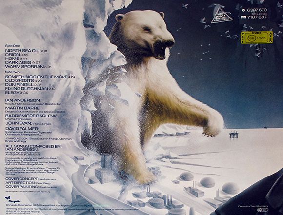 Rock On David!  ;D  |
|
Deleted
Deleted Member
Posts: 0
|
Post by Deleted on Dec 8, 2012 20:12:56 GMT -5
Darin, Great evaluation of the ALLM cover. Made me notice things I've never seen before honestly.
You're right, could have been a great cover, considering all of the different elements.
|
|
|
|
Post by Mothfairy on Dec 9, 2012 0:16:46 GMT -5
Yeah it does make more sense now instead of looking like a bunch of stuff thrown together. My only guess was that IA liked to keep us guessing
|
|
Mttbsh
Ethnic Piano Accordian-ist
  
Posts: 115
|
Post by Mttbsh on Dec 9, 2012 2:01:37 GMT -5
If you take into account the newspaper and all of the creativity that went into writing and packaging Thick as a Brick, there is no contest.
|
|
|
|
Post by Mothfairy on Dec 9, 2012 2:15:42 GMT -5
I always loved reading the TAAB album...I first found it at my dad's house, the record version, I was quite young and didn't fully understand it though. I was like, what's a non-rabbit? Haha.
I also like when an album cover has lines from a song, HH, SFTW (back but not the one I posted I think) SW...
I just realized I like SW because it reminds me of my brother in Alaska.. Its around -35 f right now and he sends pictures of himself with a frosty beard and also of polar bears near his work. The artwork makes it seem such a dark and cold album. Does anyone else feel like the music reflects that? I know my feelings I just wanted to see what everyone else thought.
|
|
|
|
Post by Morthoron on Dec 9, 2012 9:14:02 GMT -5
If you take into account the newspaper and all of the creativity that went into writing and packaging Thick as a Brick, there is no contest. album cover is Tull's best, an iconic piece of early 70s rock. In fact, I've ranked it as one of the 25 greatest rock album cover designs of all time: darkelffile.blogspot.com/2012/09/the-greatest-rock-album-covers-of-all.htmlThick as a Brick's cover gives ample evidence why the album format for vinyl records was an art form in itself, and this art was utterly lost when compressed into CD jewel cases. I also enjoy Burton Silverman's artwork on Aqualung and James Grashow's woodcut style drawing for Stand Up. |
|
|
|
Post by Morthoron on Dec 9, 2012 9:19:03 GMT -5
I just realized I like SW because it reminds me of my brother in Alaska.. Its around -35 f right now and he sends pictures of himself with a frosty beard and also of polar bears near his work. The artwork makes it seem such a dark and cold album. Does anyone else feel like the music reflects that? I know my feelings I just wanted to see what everyone else thought. On another thread regarding Stormwatch, we talked about the album's lack of humor and darkness. It definitely lacks the humor found in its predecessors, like Songs from the Wood and Heavy Horses. The album deals in a large sense with death and solitude. |
|
|
|
Post by Tull50 on Dec 9, 2012 14:08:07 GMT -5
Nice to see how this thread is developing, as I come to see a concert of Un Tal Jethro I think this pic goes well with the thread  Un Tal Jethro Un Tal Jethro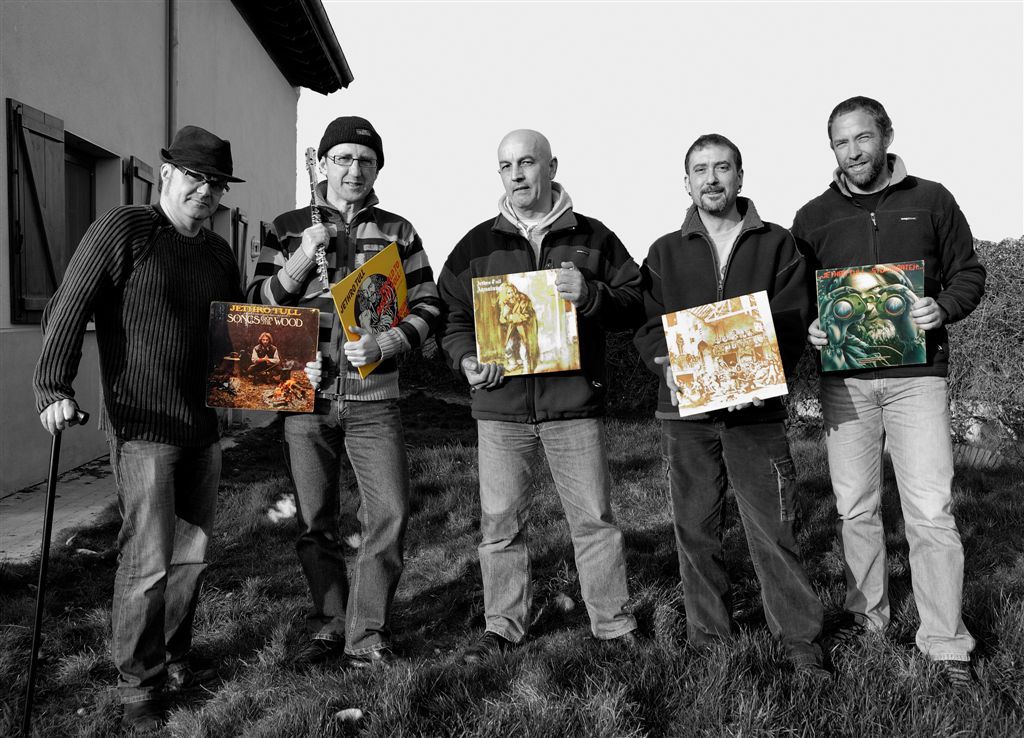 It is possible that these are their votes ...  |
|